Wet Room Design Ideas – If you are thinking about ways to spruce up your interior, then you should look into wet rooms. What is a wet room, you ask? Simple: it’s a new approach to bathroom design in which there is no tub, shower screen, or tray. The entire room is tiled from floor to ceiling and the natural gradient of the floor directs water to the drain.
If you use an open floor plan approach to, for example, your kitchen and dining area, then the wet room is in the same line of reasoning. It opens up the bathroom, can help make a small wet room look bigger, and shows that you are on the cutting edge of modern home decor. As for how to make a wet room, it requires the help of an experienced plumber or fitter.
The whole room needs to be waterproof, the floor needs a gradient, and the tiling needs to cover the walls and floor. The waterproofing is necessary because there are no bath walls or curtains keeping the water in one area. If you are not careful, you could accidentally cause water damage in your home.
Done right, however, wet rooms look amazing. They give the room an almost spa-like feel, and the tiling lets you experiment with a lot of colors and designs that would have been impossible otherwise. Wet rooms are also pretty easy to clean and maintain if you build them correctly.
The waterproofing and sealing keeps the floorboards under the tile quite safe. If you have it in the budget, you can install underfloor heating as well. That will help evaporate the water on the floor and give you more comfort, especially in the cooler months of the year. Make sure you have good ventilation so that you can prevent the formation of mildew.
The benefits of this type of design are many. First of all, it is extremely fashionable and stylish, which increases the value of your home. In terms of use, the open design is freeing and makes the bathroom feel luxurious. Curtains and walls make already small rooms smaller, and this is the opposite approach. You get more space, easier cleaning, and a great opportunity to update the room’s look.
That’s what we are going to talk about today: I will run down fifty pictures and show you how to use them for inspiration in the design of your own wet room at home. Some of them are simple and others are more complex. They also vary in their use of windows, how much space they take up, whether they have a tub, the materials they use, and so on.
By looking through the list you will be able to find at least a few that should fit well into the design of your home. I will point out the most interesting parts of each design so you can pull them out and incorporate them into a totally new idea if you want. It all depends on what you want and what you have to work with.
Emerald Mosaic Wet Room Design
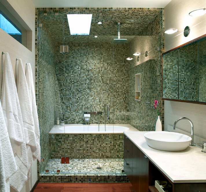
Those green tiles are a little dizzying when you look at them for the first time, especially with the mirror there. But they are so effective at setting off the bathing area from the rest of the room. The hardwood floor right outside is great: this is an excellent surface to complement tile because it has a similar feel but you can get a lot of contrast in color. If you can, try to get a little skylight into the space so that you do not need to rely on so much artificial light. That will give it a softer glow.
Brick Townhouse Wet Room Design
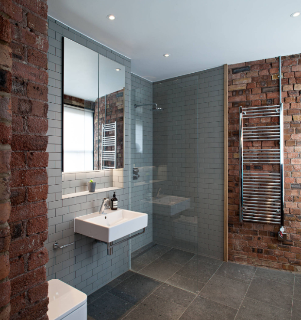
Yes, brick. Usually exposed brick is the purview of restaurants that are trying to look contemporary, but this is a very innovative and thoughtful way to use them. The red bricks give the wall a lot of texture, and the natural variation in the color of the bricks looks great. The gray brick tile is a little more practical for a bathroom, but it keeps to the overall theme. Note how the square and the rectangle show up in the sink, toilet, mirror, glass, and ledge to drive the point home. Also note the wooden transition piece in the wall.
Get Yellow Wet Room Design
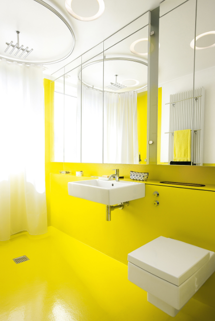
Go big or go home. Or, in this case, go big at home. A really bright color works well when you minimize breaks and interruptions. See how the color moves seamlessly across the floor and walls. Things get too overbearing when you have many surfaces with the same bright color, but broken up by tub walls or similar obstructions. This is another space-efficient design that also looks to be low-cost as far as wet room ideas go. Other primary colors would work here as well, depending on your tastes and how the rest of your house looks.
Central and Circular Wet Room
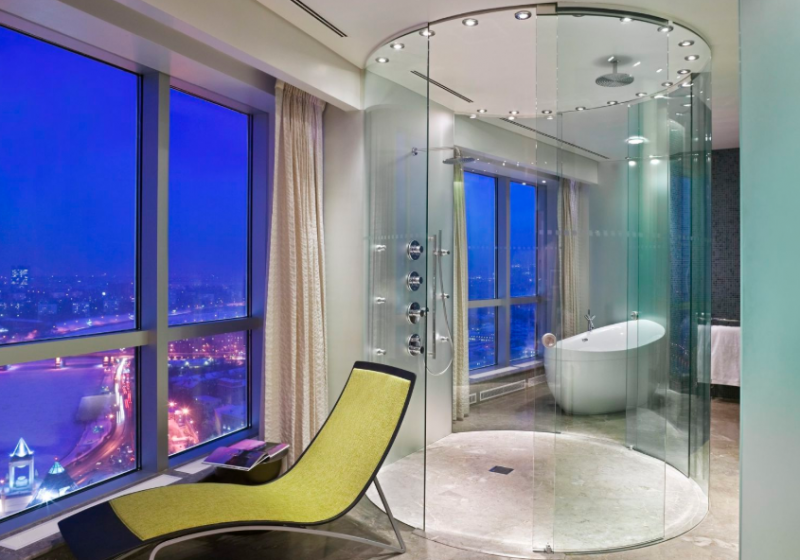
While the most common shape for showers is rectangular to accommodate a tub, it’s pretty striking to see a round design. The shower feels so much larger when it is central and glassed in instead of tucked into a corner behind a curtain. See how the reclined chair defines the room to be about comfort and relaxation. That’s a great attitude to have for this kind of design. I would like to see a little more color, but that’s up to you. Even a small wet room feels larger with this kind of open design.
Two-Tone Theme Wet Room Design
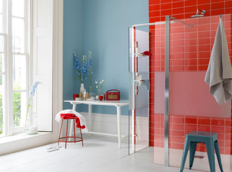
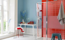
Look how beautiful this is. With just two colors and some glass, this room is transformed. You don’t need to go all the way of adding flowers, but see how simple, bold colors and the open design work together to make the room large and modern. It doesn’t have to be red and blue, but they work great together. Note the range of shades in the towels, stool, and other elements. The white brings it all together. You might want to skip on the floor to ceiling window in the interests of privacy.
